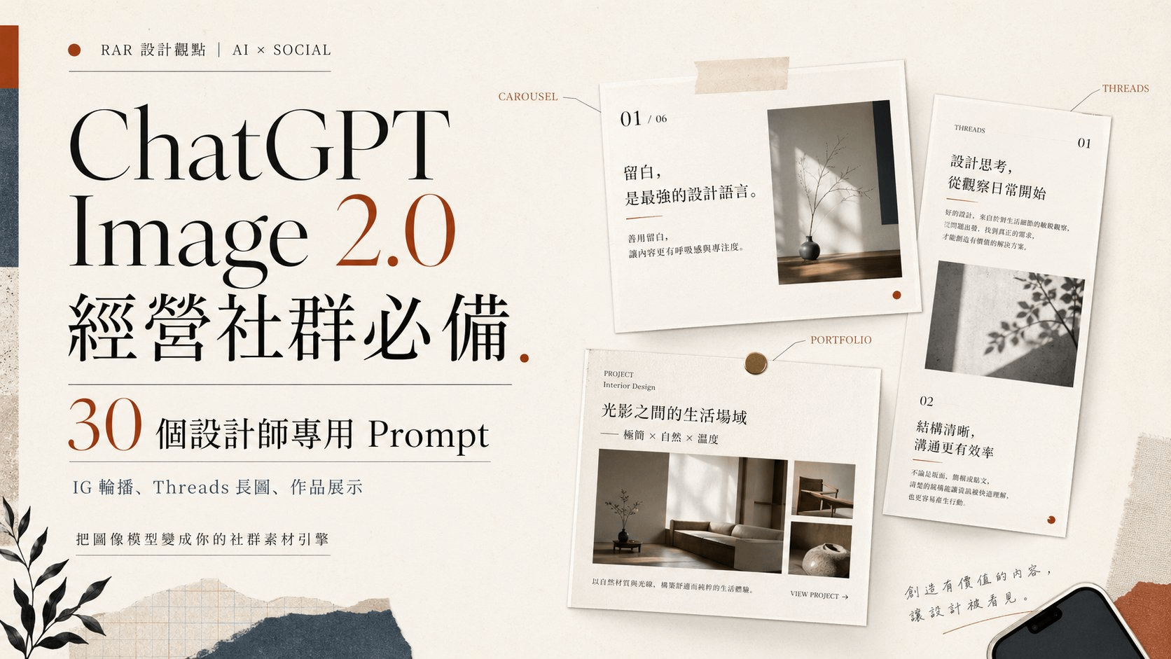
ChatGPT Image 2.0 經營社群必備:30 個設計師專用 Prompt(IG 輪播、Threads 長圖、作品展示)

2026年4月27日 上午 3:46
做社群最累的不是構想,是不停輸出視覺素材。每天一張貼文圖、每週一組 IG 輪播、每個月一份數據卡、每季一波個人品牌 hero shot——設計師再會做圖,產量永遠跟不上演算法的胃口。Figma 開到第十個分頁,還在拉相同的標題卡。
2026 年 4 月推出的 ChatGPT Image 2.0(API 名稱 gpt-image-2)改變了這個耗能。它的中文字寫得對、版面結構抓得準、Thinking 模式下單次能產出 8 張風格連貫的圖。對需要持續餵內容的社群經營者來說,這是從「靈感工具」升級成「素材引擎」的分水嶺。
這篇文章整理了 30 個分類 prompt,每個都附英文 + 中文翻譯。英文版直接複製就能丟進 ChatGPT(這個模型在英文 prompt 上的指令遵循能力最穩定),中文翻譯方便你理解每個欄位在做什麼、要替換哪些變數。所有變數用 [方括號] 標出,把括號裡換成你自己的內容就能跑。
CHAPTER 01 / WHY IT MATTERS
為什麼 ChatGPT Image 2.0 是社群經營的轉折點
先講結論:對設計師來說,過去用 Midjourney、DALL-E 3 做社群素材的最大痛點是「離可用還差最後一哩」——構圖看起來不錯,但中文字像鬼畫符、品牌名拼錯、版面散掉、同一個角色畫第二次完全變成另一個人。你不能直接放上 IG,得進 Photoshop 補字補貼回 logo。
Image 2.0 把這三道障礙幾乎清空了。對社群來說有三個關鍵能力:
CAPABILITY 01
中文字級正確、能放上去就直接用
過去 AI 圖最大笑點是文字。Image 2.0 在中日韓、印地語、孟加拉語等非拉丁文字的渲染準確率大幅提升,PixVerse 實測 20 張中有 19 張字寫得對。對 quote card、IG 輪播、活動海報來說,這是直接決定「能不能 ship」的能力。
CAPABILITY 02
先「想」再畫,版面不再亂
這是業界第一個內建 reasoning 的圖像模型。Thinking 模式下,模型會先研究 prompt、規劃版面、查證事實,再下筆。對資訊圖表、簡報、長文字長圖、密集多元素的版面來說,成功率遠超前代。
CAPABILITY 03
一次 8 張、角色與風格連貫
對社群來說最關鍵:IG 8 連發輪播、漫畫分鏡、系列封面、產品多角度,過去要產一致風格得來回 prompt 十次以上。Image 2.0 在 Thinking 模式下單一 prompt 可一次產出 8 張連貫的圖,角色、配色、構圖都不會跑掉。
▲ OPENAI 官方發表會 KEYNOTE
"
最好的社群素材,不是讓人哇一聲的那張,是你今天 ship 出去、明天還能再 ship 的那張。
— RIVEN
CHAPTER 02 / FUNDAMENTALS
寫 prompt 前要知道的 5 個社群心法
這 5 條來自 OpenAI 官方 cookbook 的 prompting guide,是工程師在 alpha 階段反覆驗證出來的模式。先把心法看完再進範例,效果差很多。
01 / 用 ARTIFACT SPEC 思維寫,不是 ILLUSTRATION 思維
不要寫「一張漂亮的 IG 貼文」,要寫「a 1080×1350 Instagram post for [your brand], featuring [headline] in 48pt bold, with [accent color] background」。把它當成交付物的規格書,不是插畫描述。Image 2.0 在 spec 思維下表現遠優於寫意敘述。
02 / 文字用引號鎖死、字體風格直接寫
要出現在畫面裡的字一律用 "verbatim text here" 或 ALL CAPS 包起來,模型才不會擅自改字。字體風格直接寫 bold sans-serif、condensed grotesk、Georgia serif、handwritten marker,不用真的指定 Helvetica(模型不認得字型授權,但認得風格)。中文字寫進 prompt 時也用引號包起來:headline reads "持續輸出,比完美更重要"。
03 / 用真實尺寸與長寬比,不要用「直式」「橫式」
Image 2.0 支援從 3:1 到 1:3 的任意長寬比。直接寫 1080×1350(IG post)、1080×1920(IG story)、1500×500(X 橫幅)、1280×720(YouTube 縮圖)會比寫「portrait」「landscape」精準很多。記得社群尺寸都要在 prompt 裡明確指定。
04 / 防呆三件套永遠要寫
每個 prompt 結尾都加 No watermark, no extra text, no random logos。模型偶爾會自己加上看起來像 logo 的圖案、奇怪的英文標語、或浮水印,這三句話可以擋掉 90%。社群素材尤其重要,不然會多出一堆要 P 掉的東西。
05 / 系列要連貫就用 "the same character" + 上傳第一張
想做角色一致的系列貼文(IG 連續八張、漫畫分鏡),先用 Thinking 模式生第一張當錨點,後面每張都把第一張當參考圖上傳,並寫 same character, same outfit, same style as input image。Image 2.0 的 input fidelity 遠強於前代,能撐住 5–8 張不崩。
CHAPTER 03 / PERSONAL BRAND
個人品牌視覺|Prompt 01–03
先把個人品牌的「定裝照」做好,後面所有貼文素材才有參考點。這三個 prompt 對應你會反覆用到的:大頭貼、bio 圖、avatar。所有變數用 [方括號] 標出來,自己替換。
PROMPT 01|編輯部風格大頭貼
用途:LinkedIn / Threads / IG profile photo(1:1)
A photorealistic editorial portrait of a confident East Asian woman in her mid-30s, with shoulder-length straight black hair that ends right at the collarbone — tidy and naturally styled, not wet, not flyaway. She wears a charcoal merino crewneck sweater. Soft north-facing window light from the left, clearly illuminating the left side of her face with a gentle highlight on the cheekbone, subtle shadow on the right side. Neutral warm gray studio backdrop. Subtle film grain, 85mm lens look, shallow depth of field with the background slightly out of focus. She looks directly into the camera with a calm, grounded gaze — quiet confidence, slight closed-mouth smile. Visible faint laugh lines and skin texture, no glamour retouching, no smoothing filter. Square 1:1 framing, head and shoulders, subject centered with the head in the upper-third per rule of thirds, balanced negative space.
▸ 中文翻譯
一張寫實的編輯部風格人像,主角是一位三十多歲、自信沉穩的東亞女性,留及鎖骨的直黑髮(頭髮整齊自然,不要濕髮、不要飛散)。穿炭灰色羊毛圓領毛衣。柔和的北向窗光從左側打進來,明確照亮左半臉、左顴骨有柔和高光,右側帶細微陰影。中性暖灰攝影棚背景。輕微底片顆粒、85mm 鏡頭感、淺景深背景微微失焦。她直視鏡頭,眼神沉穩、嘴角微微上揚的閉嘴微笑——是內斂的自信感。看得見細微的笑紋與真實皮膚紋理,不要美肌、不要平滑濾鏡。1:1 正方形構圖,頭肩比例,主角置中,頭部位於上三分之一(三分法則),構圖留白平衡。
▸ 實測結果 ✓


▲ Thinking 模式實測。Image 2.0 在寫實人像上仍偏年輕化、髮長易超出指定(鎖骨長度),眼神略內收。可作為起點,最終定裝照建議搭配 Midjourney 或攝影師補足。
PROMPT 02|About-me mood board 圖
用途:個人網站 about page hero、IG 自介貼文(1080×1350)
A flat-lay editorial mood board for a designer's about page, top-down photograph on a warm beige linen surface. Arranged objects: a black Moleskine notebook with a fountain pen, a small ceramic coffee cup, three Pantone chip cards in muted colors, an open book showing typography spreads, a film camera, a single dried eucalyptus stem. Soft window light from the upper-left, real shadows, slight imperfection in arrangement. 1080×1350. No text, no logos, no overly styled food-photography polish.
▸ 中文翻譯
一張設計師 about page 用的編輯部風格 mood board,從上往下俯拍,背景是暖米色亞麻桌面。擺放物:一本黑色 Moleskine 筆記本配鋼筆、一只小陶瓷咖啡杯、三張低彩度的 Pantone 色票卡、一本展開的字體排版書、一台底片相機、一支乾燥尤加利。窗光從左上方柔和打入,真實陰影,擺放略帶不規整。1080×1350。不要文字、不要 logo、不要過度修整的食物攝影感。
▸ 實測結果 ✓

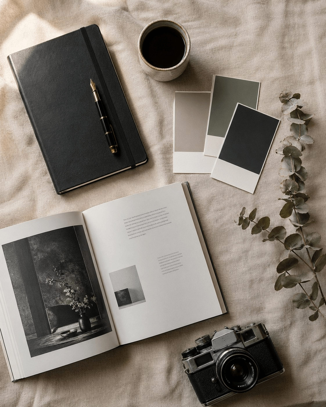
▲ Thinking 模式實測,幾乎完整命中:Moleskine + 鋼筆、陶瓷咖啡、3 張低彩度色票、攝影書、底片相機、乾燥尤加利、暖米色亞麻、左上窗光全部到位。物件擺放略集中於左側,自己挑時可請 Image 2.0 重生 1–2 張選最平衡的版本。
PROMPT 03|風格化 avatar 插畫
用途:個人 logo 頭像、podcast cover、newsletter avatar
A minimalist vector-style illustrated avatar of [a person with short dark hair, round glasses, wearing a turtleneck], in the style of editorial New Yorker spot illustrations. Limited two-color palette: warm cream background and a single muted gold for the figure. Simple confident lines, no shading gradients, balanced negative space, strong silhouette that reads at small sizes. Centered composition, generous padding, no text, no signature, no watermark.
▸ 中文翻譯
一張 minimalist vector 風格的設計師頭像插畫,主角是 [一位短髮、戴圓框眼鏡、穿高領毛衣的人],風格類似 New Yorker 編輯部的 spot illustration。雙色限定色票:暖奶油色背景 + 單一低彩度金色作為人物色。簡潔自信的線條、不要漸層陰影、留白平衡、剪影在小尺寸下也清楚可辨。置中構圖、留充足 padding,不要文字、不要簽名、不要浮水印。
▸ 實測結果 ✓


▲ Thinking 模式實測,命中度極高:暖奶油背景 + 單一金色、New Yorker 風格 spot illustration、圓框眼鏡、高領毛衣、簡潔自信線條全部到位。剪影乾淨、小尺寸辨識度好,可直接當頭像或 podcast cover 用。
CHAPTER 04 / INSTAGRAM POSTS
Instagram 知識型圖文|Prompt 06–10
輪播是 IG 演算法現在最吃的格式,但要產 8 張風格連貫的卡是真累。Thinking 模式下,Image 2.0 可以一次出 8 張角色與排版都連貫的圖,是這代最值得投資的能力。
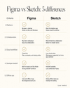
PROMPT 06|5 張一組設計知識卡
用途:IG 輪播教學貼(1080×1350 × 5)
Generate a 5-panel Instagram carousel teaching "[5 typography rules every designer should know]". Each panel is 1080×1350 with consistent design system: warm off-white background, 11pt monospace gold label "RULE 0X" top-left, 42pt thin serif rule title centered upper-third, 16pt body sans-serif explanation in middle, single small visual diagram or example below. Panel 1 is the cover with the topic title, panels 2–5 are one rule each. Same typography, same color, same margins across all panels. No watermark, no extra logos.
▸ 中文翻譯
產出一組 5 張的 Instagram 輪播教學貼,主題 "[5 typography rules every designer should know]"。每張都是 1080×1350,套用一致設計系統:暖白米色背景、左上 11pt monospace 金色 label "RULE 0X"、上三分之一置中 42pt thin serif 規則標題、中段 16pt body sans-serif 解釋、下方一個小型視覺示意或範例。第 1 張是封面標題卡,第 2–5 張各放一條規則。所有 panel 字體、配色、邊距完全一致。不要浮水印、不要多餘 logo。
▸ 實測結果 ✓
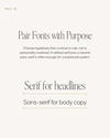
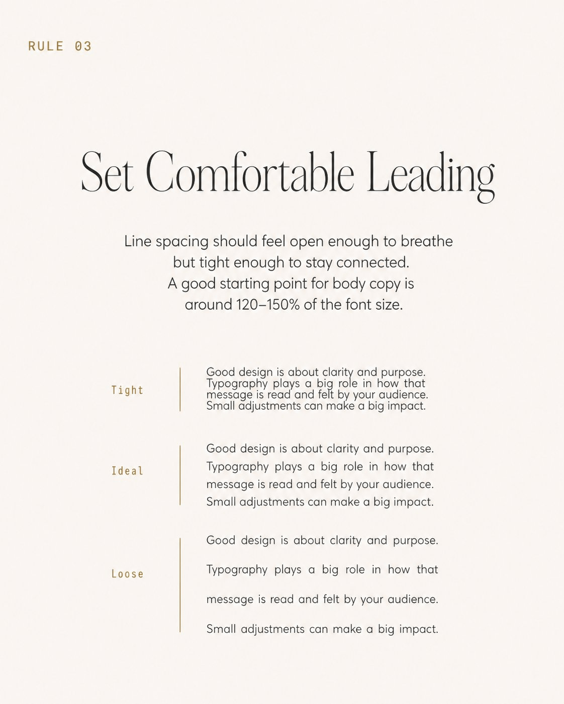
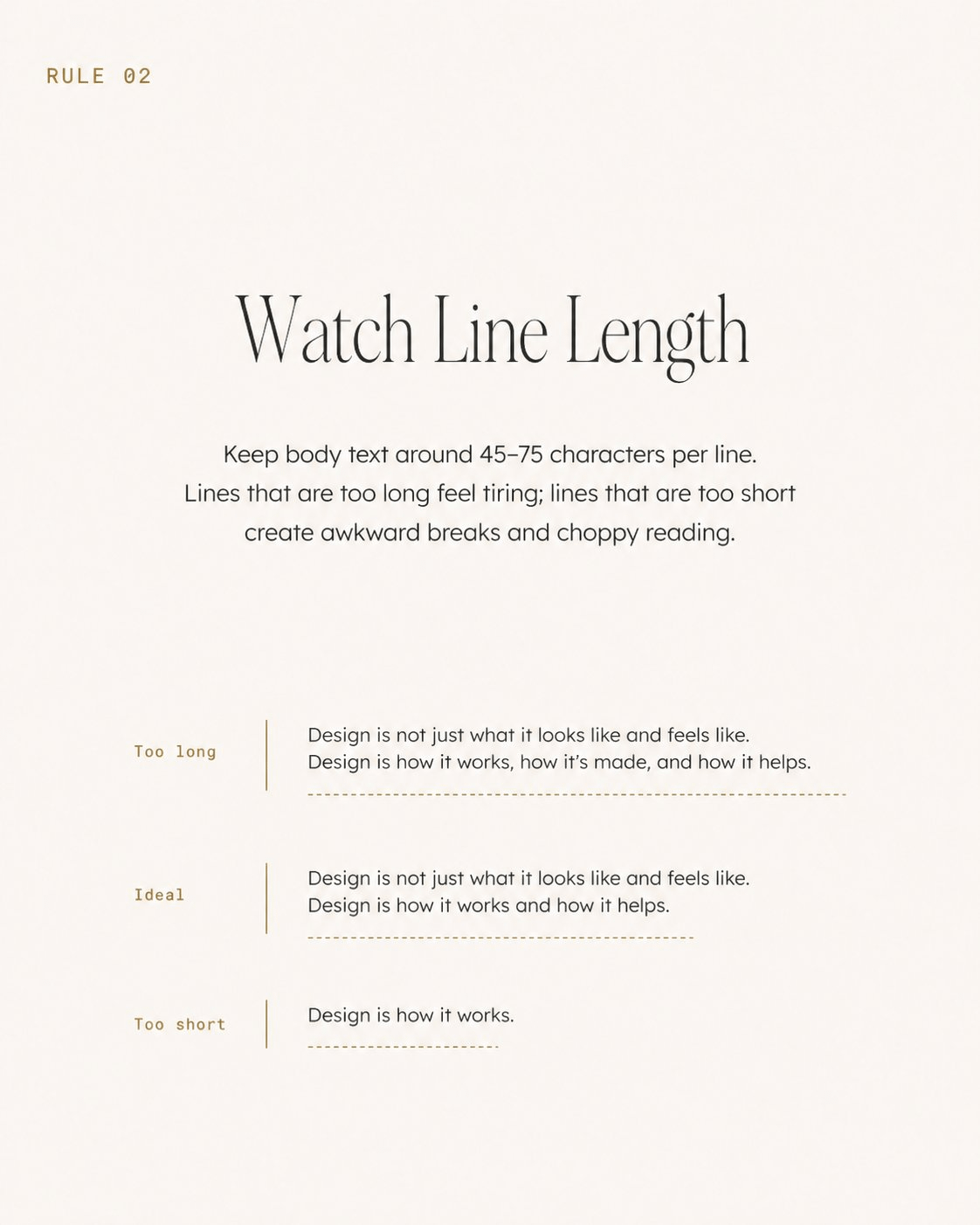
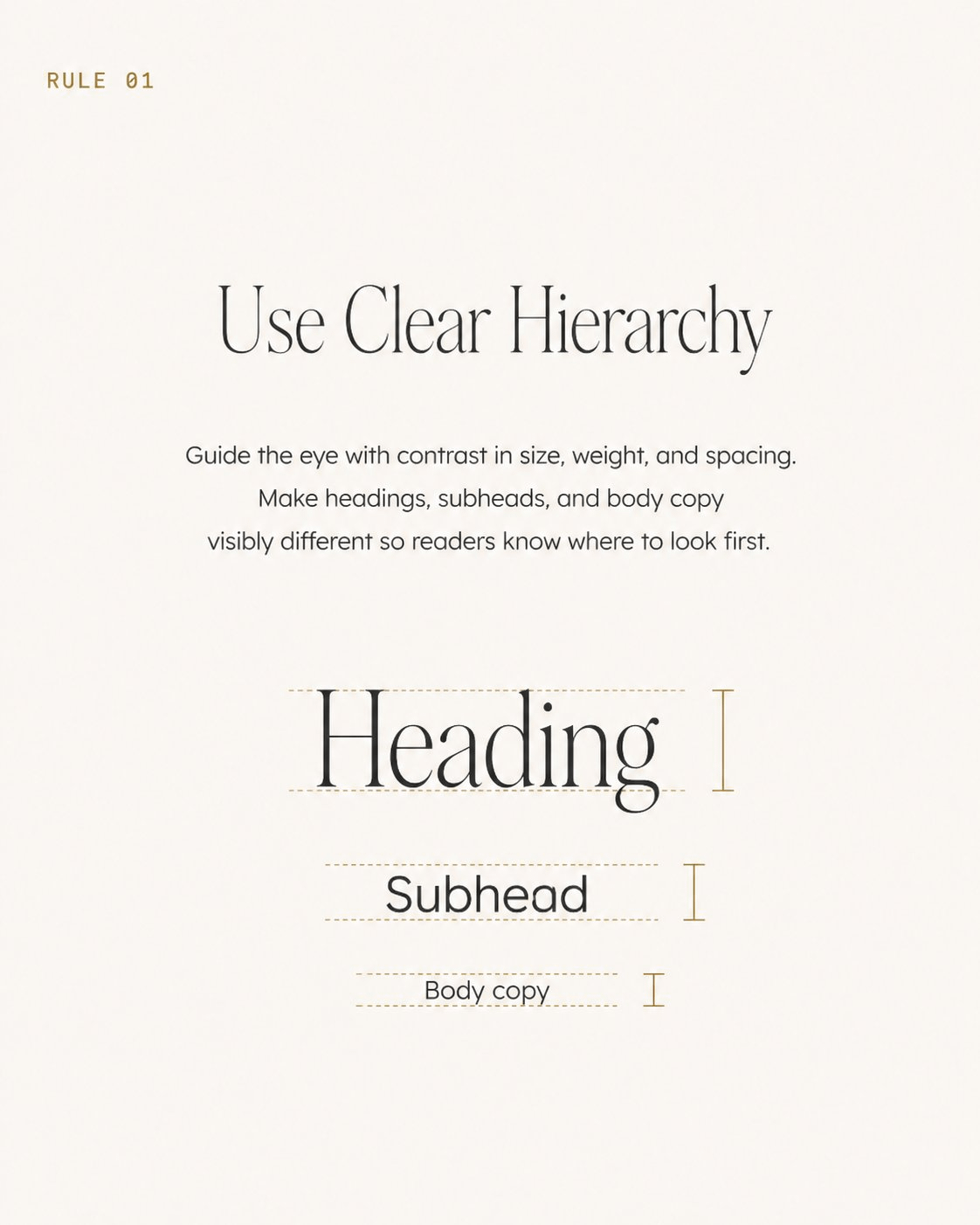
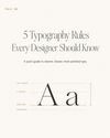
▲ Thinking 模式實測,這是這代 Image 2.0 最展示能力的一張:5 張版型完全一致(金色 RULE 0X label、暖白背景、thin serif 標題、sans-serif 內文),每條規則的視覺示意都正確(hierarchy 用 Heading/Subhead/Body 的尺寸對比、line length 用三條範例線、leading 用 Tight/Ideal/Loose 三種行距對照、font pairing 用 serif/sans-serif 並列)。整組可以直接拿去發 IG 輪播。
PROMPT 08|工具比較表卡
用途:軟體比較貼、工具推薦(1080×1350)
A 1080×1350 comparison table card titled "[Figma vs Sketch: 5 differences]" rendered as a clean magazine-style infographic. Two-column layout, each column headed by the tool name in 24pt bold. Below: 5 rows of comparison criteria on the left in 14pt gray, paired check / cross icons on each side, short descriptor under each. Warm off-white background, thin hairline rules between rows, single accent gold for highlights. Bottom credit "[your handle]" in 10pt monospace right-aligned.
▸ 中文翻譯
一張 1080×1350 工具比較表卡,標題 "[Figma vs Sketch: 5 differences]",渲染成乾淨的雜誌風格資訊圖。雙欄佈局,每欄 header 是工具名 24pt 粗體。下方:5 列比較項目左側 14pt 灰色,每側配勾叉 icon、下方一行短描述。暖白米色背景、列間細髮絲線、單一金色重點色。底部右下小字 "[your handle]" 10pt monospace。
▸ 實測結果 ✓
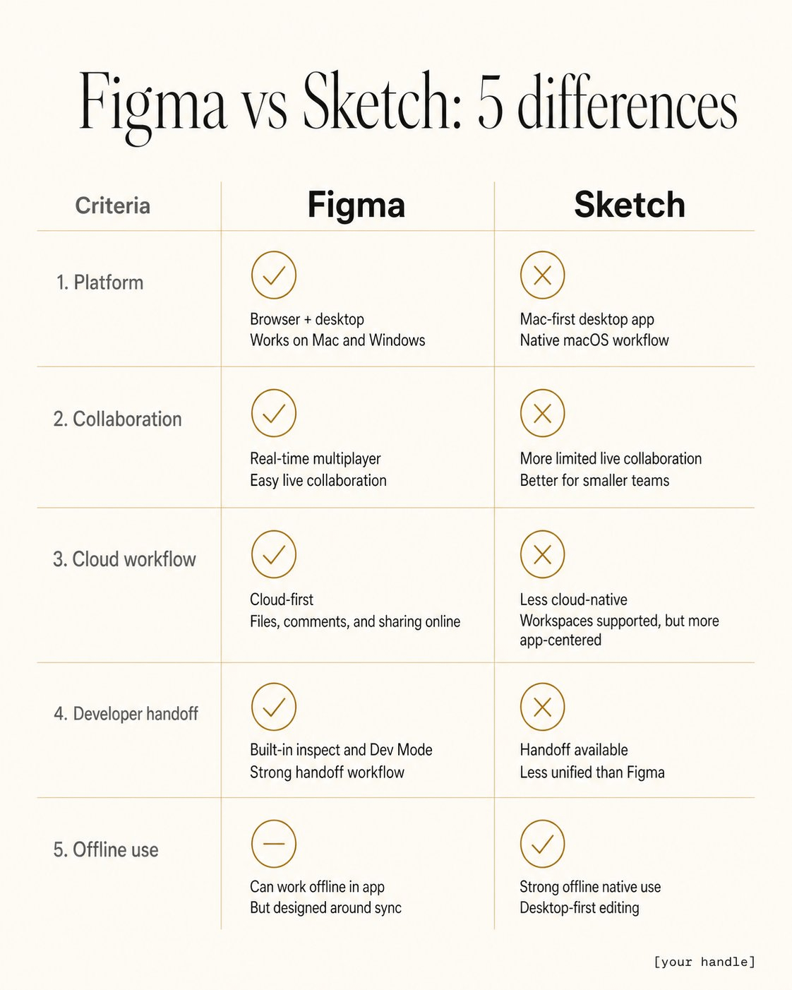
▲ Thinking 模式實測,命中度極高:標題、雙欄 24pt bold header、5 列比較項目、勾叉 icon、暖白背景、列間細金髮絲線、右下 monospace handle 全部到位,連模型自加的中央垂直分隔線也增加了表格的閱讀性。可以直接拿去發 IG 輪播。
PROMPT 09|Step-by-step 教學輪播
用途:流程教學貼(1080×1350 × 6)
A 6-panel Instagram carousel teaching "[How to structure a logo design process]". Panel 1: cover with the topic in 48pt bold serif, gold accent line below. Panels 2–6: each shows STEP 0X label top-left in monospace gold, step name in 32pt thin sans-serif, one explanatory paragraph in 16pt regular, and a clean line-art icon illustrating the step. Same warm off-white background, identical layout grid, gold accents only. Use the same icon style across all panels. No watermark.
▸ 中文翻譯
一組 6 張的 Instagram 輪播教學貼,主題 "[How to structure a logo design process]"。第 1 張:封面,主題使用 48pt bold serif,下方一條金色重點線。第 2–6 張:每張左上 STEP 0X label 使用 monospace 金色,步驟名稱 32pt thin sans-serif,下方一段 16pt regular 說明,最後一個簡潔線稿 icon 對應該步驟。所有 panel 同樣的暖白米色背景、相同版面網格、僅金色重點。所有 icon 風格完全一致。不要浮水印。
▸ 實測結果 ✓

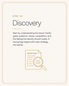
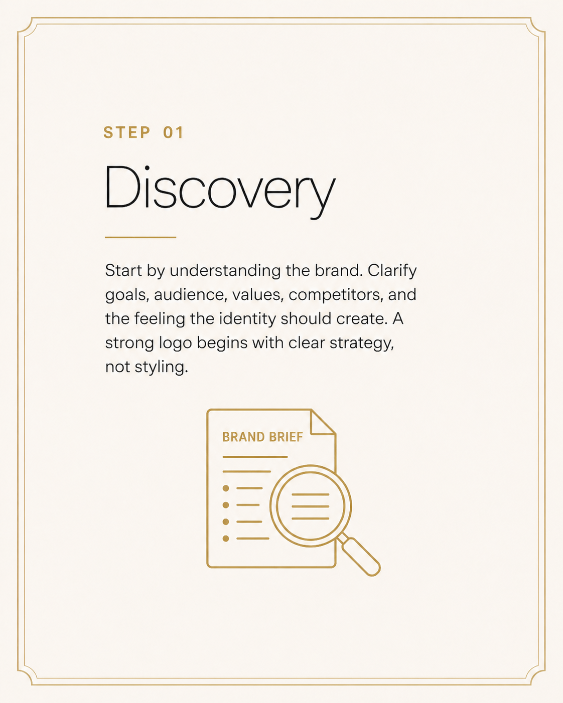
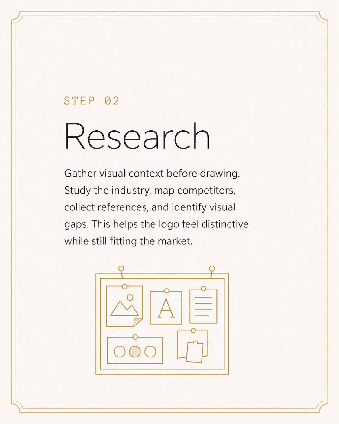
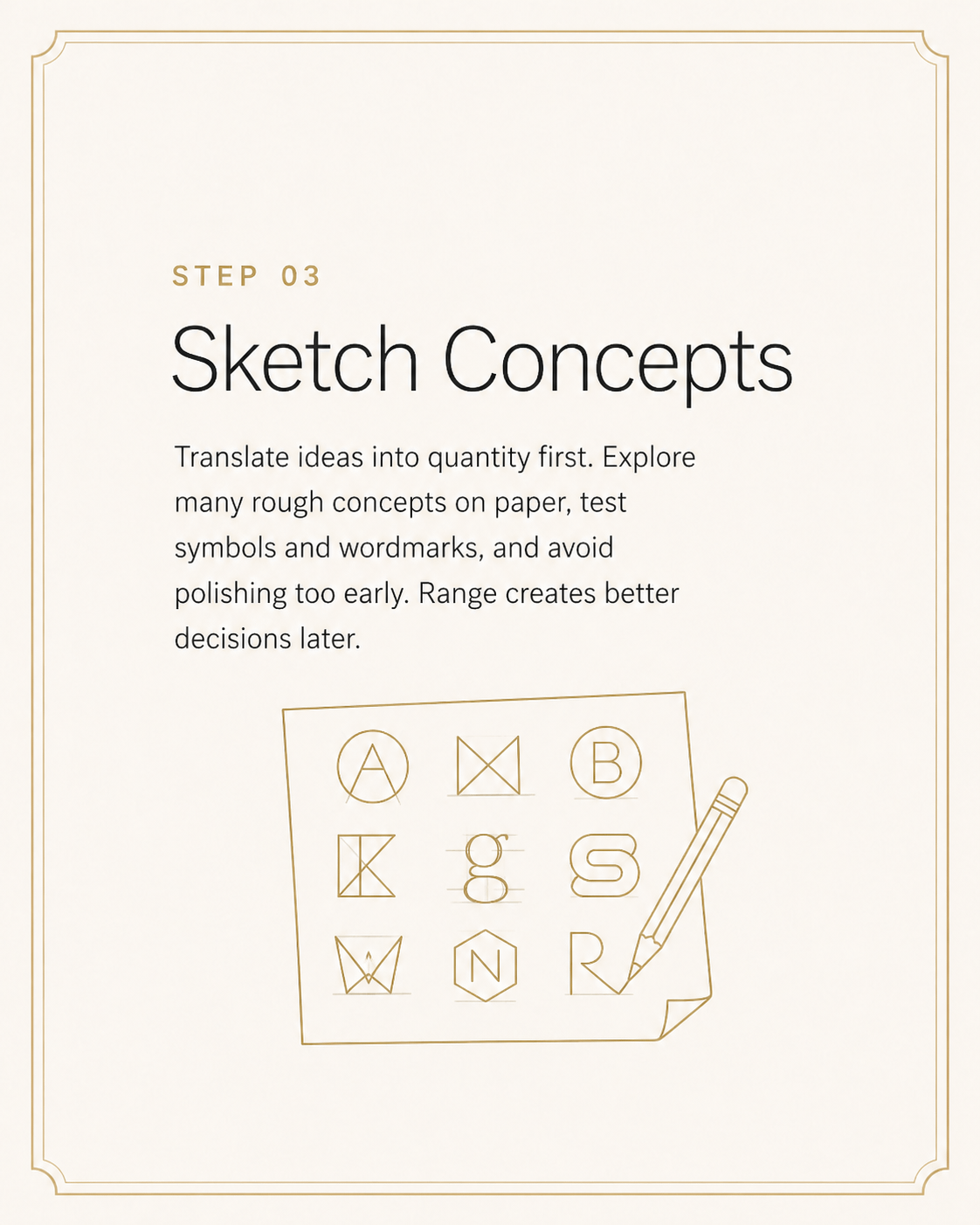
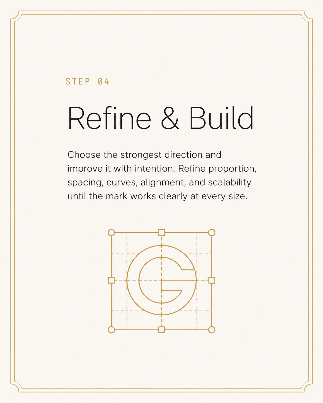
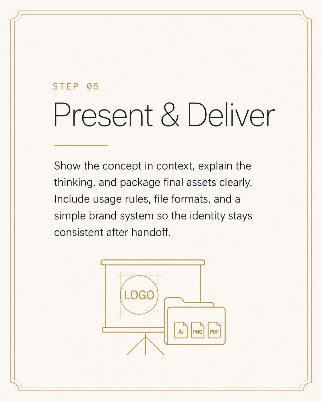
▲ Thinking 模式實測,這代 Image 2.0 連貫性能力的另一個強示範:6 張版型完全一致(暖白背景、四角金色線框、相同字體層級、相同 icon 風格),每個 step 的視覺隱喻精準(Discovery + 放大鏡、Research + mood board、Sketch + letterforms、Refine + G letterform grid、Deliver + projector & AI/PNG/PDF 檔案)。連模型自加的金色邊框裝飾都增加了 editorial 雜誌感。可直接拿去發 IG 6-panel carousel。
PROMPT 10|列表式設計建議卡
用途:條列式技巧分享(1080×1350)
A 1080×1350 list card titled "[7 things I wish I knew as a junior designer]". Title in 36pt thin serif at the top with generous padding. Below: a numbered list 01–07 in monospace gold numerals followed by short one-line tips in 18pt regular sans-serif body color. Thin hairline between each row. Bottom: small handle "[@yourhandle]" in 10pt gray. Warm off-white background, magazine column proportions, no decorative elements, no logos.
▸ 中文翻譯
一張 1080×1350 列表卡,標題 "[7 things I wish I knew as a junior designer]"。標題使用 36pt thin serif 置頂、留充足 padding。下方:01–07 編號列表,數字使用 monospace 金色,搭配每行 18pt regular sans-serif 一句話建議。每行之間細髮絲分隔線。底部小字 "[@yourhandle]" 10pt 灰色。暖白米色背景、雜誌欄位比例、不要裝飾元素、不要 logo。
▸ 實測結果 ✓
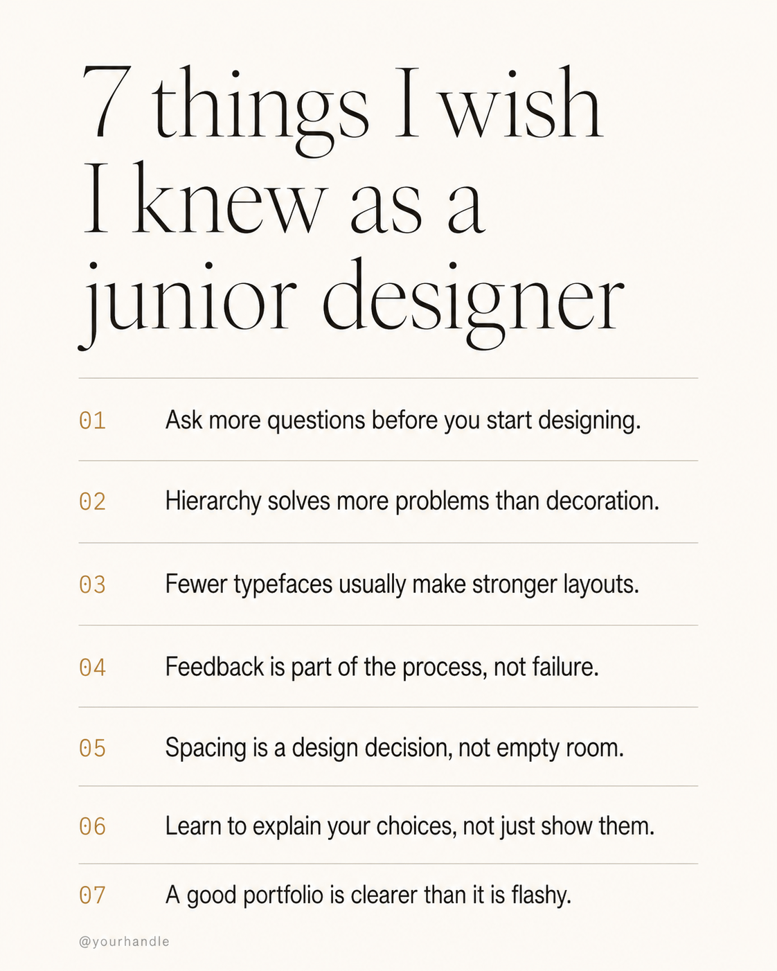
▲ Thinking 模式實測,命中度極高:標題置左 thin serif、01–07 monospace 金色數字、每行細髮絲分隔線、左下 @yourhandle 灰色小字、暖白米色背景、純字排無裝飾全部到位,連 7 條建議內容(hierarchy、fewer typefaces、spacing、explain choices…)也都實際命中「對 junior designer 真正有用」的方向。可以直接換上自己的 handle 拿去發 IG 或 Threads。
CHAPTER 05 / TEXT-FORWARD
Threads 與文字長圖|Prompt 11–15
這一類最考驗模型的中文渲染。過去用 Midjourney 寫中文 quote card 幾乎不可能,現在 Image 2.0 可以做到,但訣竅是把要寫的字用引號包住、明確指定字型風格與大小。Threads 演算法吃文字長圖,這五個是高頻使用的版型。
PROMPT 11|短句金句卡
用途:Threads 引言、IG 語錄(1080×1350)
A 1080×1350 quote card. Warm cream background. A single oversized 88pt thin Georgia-style serif quotation reads "[持續輸出,比完美更重要]" centered with generous line-height. Above it a small 11pt monospace gold label "ON CRAFT". Below the quote, attribution "— [your name]" in 14pt regular sans-serif gray. Tons of negative space top and bottom. No watermark, no extra graphics, no decorative borders.
▸ 中文翻譯
一張 1080×1350 金句卡。暖奶油背景。中央放一段超大 88pt thin Georgia-style serif 引言 "[持續輸出,比完美更重要]",置中、行距充足。上方一個小 11pt monospace 金色 label "ON CRAFT"。引言下方一行署名 "— [your name]" 使用 14pt regular sans-serif 灰色。上下大量留白。不要浮水印、不要多餘圖案、不要邊框裝飾。
PROMPT 12|觀點長圖(Hot take 卡)
用途:Threads 觀點貼、行業評論(1080×1350)
A 1080×1350 opinion post card. Top-left small label "HOT TAKE" in 11pt monospace red, all caps. Headline below in 38pt bold sans-serif: "[你不需要更多工具,你需要 ship 完一個]". Then a 3-line body explaining the take in 18pt regular gray, comfortable line-height. Bottom thin gold horizontal rule, attribution "[@yourhandle · designer]" right-aligned in 11pt monospace. Warm off-white background, editorial newsletter style, no other elements.
▸ 中文翻譯
一張 1080×1350 觀點長圖。左上小 label "HOT TAKE" 使用 11pt monospace 紅色、全大寫。下方主標 38pt bold sans-serif:"[你不需要更多工具,你需要 ship 完一個]"。再下方 3 行 18pt regular 灰色內文,行距舒適。底部一條細金線、署名 "[@yourhandle · designer]" 右側 11pt monospace。暖白米色背景、編輯部 newsletter 風格,不要其他元素。
PROMPT 13|提問互動卡
用途:促進留言互動、社群提問(1080×1350)
A 1080×1350 question card designed to drive engagement. Centered oversized 96pt thin serif question mark glyph in light gold (#d4a259) at the top. Below it the actual question in 32pt regular sans-serif: "[你工作的時候用什麼字體?]". Sub-line in 16pt italic gray: "Reply with your go-to choice." Warm cream background, no other elements, very calm composition that invites a tap-to-reply.
▸ 中文翻譯
一張 1080×1350 提問互動卡,目的是促進留言。上方置中放一個超大 96pt thin serif 問號字符,使用淡金色 (#d4a259)。下方是實際的問句,使用 32pt regular sans-serif:"[你工作的時候用什麼字體?]"。再下一行 16pt italic 灰色副句:"Reply with your go-to choice."。暖奶油背景、無其他元素、構圖極為平靜,邀請讀者點開回覆。
PROMPT 14|兩列對照圖(X vs Y)
用途:對立觀點、習慣對比(1080×1350)
A 1080×1350 split comparison post. Title at top in 32pt bold sans-serif: "[初級設計師 vs 資深設計師]". Below, two clean columns separated by a thin gold vertical rule. Left column header in 16pt monospace gray "JUNIOR", right header "SENIOR" in monospace gold. Five short comparison rows under each header in 14pt regular, simple and balanced. Bottom handle in 10pt right-aligned. Warm off-white background, no graphics or icons, pure typography composition.
▸ 中文翻譯
一張 1080×1350 雙欄對照貼。上方標題 32pt bold sans-serif:"[初級設計師 vs 資深設計師]"。下方兩欄之間一條細金色垂直分隔線。左欄 header 16pt monospace 灰色 "JUNIOR"、右欄 "SENIOR" 使用 monospace 金色。每欄下方 5 行對比,14pt regular,簡潔對齊。底部署名右側 10pt。暖白米色背景,不要任何圖示、不要插畫,純字排構圖。
PROMPT 15|列表式建議圖
用途:實用建議貼(1080×1350)
A 1080×1350 list-format social post titled "[5 things to do before you open Figma]". Title in 38pt thin serif at top. Below: 5 rows numbered 01–05 in oversized monospace gold numerals (28pt) on the left, paired with one-line action items in 16pt regular sans-serif on the right. Each row separated by tons of whitespace. No icons, no illustrations, no logos—pure type-driven editorial composition. Warm cream background.
▸ 中文翻譯
一張 1080×1350 列表式社群貼,標題 "[5 things to do before you open Figma]"。標題使用 38pt thin serif 置頂。下方 5 行,左側 01–05 超大 28pt monospace 金色數字,右側搭配 16pt regular sans-serif 一句話行動項目。每行之間大量留白。不要 icon、不要插畫、不要 logo——純字排編輯部構圖。暖奶油背景。
CHAPTER 06 / PORTFOLIO
作品集與專案展示|Prompt 16–20
作品要被看到,需要的不是更多作品,是更會講故事的封面。這五個 prompt 對應你在 IG、Behance、個人網站會用到的:專案封面、case study 流程、mockup 組合、過程紀錄、portfolio hero。
PROMPT 16|專案封面圖
用途:IG 專案發表、Behance cover(1080×1350)
A 1080×1350 portfolio project cover titled "[Project Name]". Composition: large 14pt monospace gold label "CASE STUDY · 2026" top-left, project name in 56pt bold sans-serif center-left, one-line project description in 16pt regular gray below. Right half: a tasteful single mockup of [the project's main deliverable, e.g., a mobile app screen on a clean device frame]. Warm off-white background, generous whitespace, magazine-cover proportions. No multiple mockups, no logos, no decorative elements.
▸ 中文翻譯
一張 1080×1350 作品集專案封面,標題 "[Project Name]"。構圖:左上 14pt monospace 金色 label "CASE STUDY · 2026",左中專案名稱 56pt bold sans-serif,下方一行 16pt regular 灰色專案描述。右半邊:一張單獨的 [專案主要交付物的優雅 mockup,例如 mobile app 螢幕在乾淨的裝置框內]。暖白米色背景、充足留白、雜誌封面比例。不要多個 mockup、不要 logo、不要裝飾元素。
PROMPT 17|Case study 流程圖
用途:作品集流程說明(1080×1350)
A clean 1080×1350 case study process diagram showing 5 stages: Research → Wireframe → Visual → Prototype → Test. Each stage rendered as a small rectangular card with stage name in 18pt bold, brief sub-line in 12pt gray, and a minimal line-art icon. Cards connected by thin gold arrows in a horizontal flow that wraps to two rows. Warm off-white background, consistent card sizing, perfect alignment. Title at top "[Project Name] · Process" in 28pt thin serif. No watermark, no extra explainer text.
▸ 中文翻譯
一張 1080×1350 簡潔的 case study 流程圖,顯示 5 個階段:Research → Wireframe → Visual → Prototype → Test。每個階段渲染成一個小型矩形卡,包含階段名稱 18pt bold、12pt 灰色副句、簡潔線稿 icon。卡片之間用細金色箭頭連接,排成水平流動換行兩列。暖白米色背景、卡片大小一致、完美對齊。上方標題 "[Project Name] · Process" 使用 28pt thin serif。不要浮水印、不要多餘說明文字。
PROMPT 18|多 mockup 組合圖
用途:跨裝置展示(1080×1350)
A 1080×1350 device mockup composition for a design project. Floating in space on a soft warm beige gradient: a tilted iPhone showing [the app home screen], a flat MacBook Pro showing [the desktop dashboard], and a square print A4 brochure showing [the brand identity]. Cohesive lighting from upper-left, soft realistic shadows under each device, no harsh reflections. Devices read as physical objects, not flat illustrations. Project name "[Project]" in small 14pt monospace gold bottom-left. No extra text, no watermark.
▸ 中文翻譯
一張 1080×1350 跨裝置 mockup 組合圖。在柔和暖米色漸層背景上漂浮:一台傾斜的 iPhone 顯示 [app 首頁]、一台平放的 MacBook Pro 顯示 [桌面儀表板]、一張正方形 A4 印刷品 brochure 顯示 [品牌識別]。光源從左上一致打入、每個裝置下方真實陰影、無強反光。裝置看起來像實體物件而非平面插畫。專案名 "[Project]" 14pt monospace 金色放在左下角。不要其他文字、不要浮水印。
PROMPT 19|設計過程紀錄圖
用途:behind-the-scenes、過程貼(1080×1350)
A photorealistic top-down photo of a designer's workspace mid-project. On a warm wood desk: an open MacBook showing a Figma file with wireframes, scattered sticky notes with handwritten ideas, a coffee cup with steam, an open notebook with rough sketches, a phone showing reference photos. Soft afternoon window light, real shadows, slightly messy and authentic, not staged-Pinterest-perfect. 1080×1350 portrait crop. No text overlays, no watermark, real lived-in workspace energy.
▸ 中文翻譯
一張寫實的設計師工作桌面俯拍照,工作中的場景。在暖色系木桌上:一台打開的 MacBook 顯示 Figma 線稿檔、散落的便利貼上有手寫想法、一杯冒煙的咖啡、一本翻開的筆記本帶粗略草圖、一支手機顯示參考照片。柔和午後窗光、真實陰影、有點凌亂但真實,不要那種刻意擺拍的 Pinterest 完美感。1080×1350 直式裁切。不要文字疊加、不要浮水印,要有真實使用過的工作空間氛圍。
PROMPT 20|Portfolio hero 圖
用途:個人網站首頁、IG pinned(1500×1000)
A 1500×1000 portfolio website hero composition. Left half: oversized headline in 80pt thin serif "[Designer Name]", below it a one-sentence positioning in 22pt regular: "[Designing tools that help creators ship every day]". Right half: a single asymmetrical floating mockup of [your most representative project] on a soft warm beige gradient background, subtle shadow grounding it. Bottom-left a small "AVAILABLE FOR WORK" 11pt monospace gold pill. Editorial confident composition, lots of breathing space. No navigation bar, no extra logos.
▸ 中文翻譯
一張 1500×1000 個人作品集網站首頁構圖。左半邊:超大主標 80pt thin serif "[Designer Name]",下方一句 22pt regular 定位語:"[Designing tools that help creators ship every day]"。右半邊:一張不對稱漂浮的 [最具代表性專案] mockup,置於柔和暖米色漸層背景上,下方有微妙陰影定錨。左下角小型 "AVAILABLE FOR WORK" 11pt monospace 金色 pill。編輯部風格、自信構圖、大量呼吸空間。不要導覽列、不要多餘 logo。
CHAPTER 07 / DATA & RECAP
數據與年度回顧|Prompt 21–25
數據視覺化過去是 AI 圖最弱的一環——數字會錯、軸會亂、圖表會湊。Image 2.0 在 Thinking 模式下對結構化資訊處理大幅提升,OpenAI 官方甚至直接示範用它做 Series A pitch deck slides。
PROMPT 21|年度回顧資訊圖表
用途:年底總結貼(1080×1350)
A 1080×1350 year-in-review infographic titled "[2026 in numbers]". Top: oversized 84pt thin serif year "2026" with a thin gold underline. Middle: a 2×2 grid of stat blocks, each containing a giant 56pt bold number ([52], [12K], [8], [3]) with a 12pt regular label below ([articles published], [followers gained], [products shipped], [countries visited]). Thin hairline rules between blocks. Bottom: small handle in 11pt monospace gold. Warm off-white background, magazine annual-report style, no decorative graphics.
▸ 中文翻譯
一張 1080×1350 年度回顧資訊圖,標題 "[2026 in numbers]"。上方:超大 84pt thin serif 年份 "2026",下方一條細金色底線。中間:2×2 stat block 網格,每格內含一個巨大 56pt bold 數字([52]、[12K]、[8]、[3])配 12pt regular 標籤([articles published]、[followers gained]、[products shipped]、[countries visited])。block 之間細髮絲分隔線。底部小字 11pt monospace 金色 handle。暖白米色背景、雜誌年報風格、不要裝飾圖案。
PROMPT 22|月報 stats card
用途:月底回顧、社群透明分享(1080×1350)
A 1080×1350 monthly stats card titled "[April 2026 · Recap]". Header has the month/year in 14pt monospace gold all caps. Below: 3 horizontal stat rows, each with a left-aligned label in 16pt regular gray, a middle 36pt bold number in dark, and a right-aligned trend indicator (small "+12%" pill in muted green or "−3%" in muted red, 11pt). Categories: [newsletter subscribers], [content shipped], [revenue]. Thin hairline between rows. Footer one-line "[your handle]" right-aligned in 10pt. Warm cream background.
▸ 中文翻譯
一張 1080×1350 月報 stats 卡,標題 "[April 2026 · Recap]"。Header 月份/年份使用 14pt monospace 金色全大寫。下方:3 行水平 stat 列,每列左側 16pt regular 灰色標籤、中央 36pt bold 深色數字、右側對齊一個 trend 指示("+12%" 低彩綠色 pill 或 "−3%" 低彩紅色,11pt)。類別:[newsletter subscribers]、[content shipped]、[revenue]。列間細髮絲線。底部 "[your handle]" 右側 10pt。暖奶油背景。
PROMPT 23|Milestone 慶祝圖
用途:粉絲數達標、訂閱里程碑(1080×1350)
A 1080×1350 milestone celebration card. Centered oversized 240pt thin serif number "[10,000]" in warm gold, dominating the canvas. Above it a small 11pt monospace label "MILESTONE" all caps. Below the number a 22pt regular sans-serif descriptor "[subscribers and counting]". At the very bottom, a single line of attribution in 14pt italic Georgia "[Thank you for reading. — your name]". Warm cream background, calm and grateful tone, no confetti graphics, no balloons, no clichés.
▸ 中文翻譯
一張 1080×1350 里程碑慶祝卡。中央放一個超大 240pt thin serif 數字 "[10,000]" 暖金色,主導畫面。上方一個小 11pt monospace label "MILESTONE" 全大寫。數字下方一行 22pt regular sans-serif 描述句 "[subscribers and counting]"。最底部一行 14pt italic Georgia 致謝 "[Thank you for reading. — your name]"。暖奶油背景、平靜感謝的調性,不要彩帶圖案、不要氣球、不要俗套裝飾。
PROMPT 24|業務成長圖表(折線圖卡)
用途:年度業績、訂閱成長分享(1080×1350)
A 1080×1350 chart card showing a clean line chart. Title "[Newsletter growth · Jan to Dec 2026]" in 22pt thin serif top-left. The chart fills the middle 60% of the canvas: x-axis labeled monthly Jan–Dec in 11pt gray, y-axis showing values from 0 to 12K in 11pt gray. A single thin gold line ascending steadily across, with one labeled data point ("Aug · article went viral · 8.2K") highlighted with a small gold dot and a 12pt callout. Footnote bottom-right "Source: [your platform]" in 10pt italic gray. Warm off-white background, NYT data-journalism style.
▸ 中文翻譯
一張 1080×1350 折線圖卡。標題 "[Newsletter growth · Jan to Dec 2026]" 22pt thin serif 左上。圖表填滿中間 60% 畫布:x 軸 11pt 灰色月份標 Jan–Dec、y 軸 11pt 灰色 0 到 12K 數值。一條細金色折線穩定上升,其中一個資料點 ("Aug · article went viral · 8.2K") 用一個小金點 highlight、配 12pt 標註。右下角註腳 "Source: [your platform]" 10pt italic 灰色。暖白米色背景、紐約時報資料新聞風格。
PROMPT 25|訂閱者感謝圖
用途:年底感謝信封面、訂閱回饋(1080×1350)
A 1080×1350 thank-you card to subscribers. Centered: a 56pt thin Georgia serif "Thank you" in warm dark text, italics. Below: a single hand-drawn-style gold line illustration of a small envelope. Below that: a 16pt regular sans-serif paragraph (3 lines) of personal thanks "[Custom message — to everyone who reads this newsletter, who shares it with friends, who replies with one-line feedback: this whole thing only exists because of you.]". Bottom signature "— [your name]" in 14pt italic. Warm cream background, calm intimate tone, no decorations.
▸ 中文翻譯
一張 1080×1350 訂閱者感謝卡。中央:56pt thin Georgia serif "Thank you" 暖深色、義式斜體。下方:一個手繪風格的金色線稿小信封插畫。再下方:16pt regular sans-serif 三行私人致謝 "[Custom message — to everyone who reads this newsletter, who shares it with friends, who replies with one-line feedback: this whole thing only exists because of you.]"。底部署名 "— [your name]" 14pt italic。暖奶油背景、平靜親密的調性、不要裝飾。
CHAPTER 08 / EVENTS & STORIES
活動、限動與系列封面|Prompt 26–30
最後這五個是會反覆使用的「模板型」素材:活動海報、限動模板、podcast / newsletter 封面、系列文章封面組。重點是建立可複製的 spec,讓你以後只要換變數就能用。
▲ OPENAI 官方示範:複雜版面與資訊圖表
PROMPT 26|工作坊活動海報
用途:開課、工作坊宣傳(1080×1350)
A 1080×1350 minimalist event poster. Top: small label "WORKSHOP · ONLINE" in 11pt monospace gold, all caps. Center stage: 64pt thin serif title "[How to redesign your portfolio in 7 days]". Below it a 18pt regular sans-serif subline "[For mid-level designers who feel stuck]". Lower third: 3 detail rows in 14pt monospace, left-aligned: "DATE · [June 12, 2026]" / "TIME · [8 PM Asia/Taipei]" / "PRICE · [Free with newsletter signup]". Bottom-right small CTA pill "RSVP →" in gold rounded corners. Warm cream background, magazine event-flyer composition, no decorative graphics.
▸ 中文翻譯
一張 1080×1350 簡潔活動海報。上方:小 label "WORKSHOP · ONLINE" 11pt monospace 金色全大寫。中央主舞台:64pt thin serif 標題 "[How to redesign your portfolio in 7 days]"。下方一行 18pt regular sans-serif 副標 "[For mid-level designers who feel stuck]"。下三分之一:3 行細節 14pt monospace 左對齊:"DATE · [June 12, 2026]" / "TIME · [8 PM Asia/Taipei]" / "PRICE · [Free with newsletter signup]"。右下小型 CTA pill "RSVP →" 金色圓角。暖奶油背景、雜誌活動 flyer 構圖、不要裝飾圖案。
PROMPT 27|IG Story 模板(直式)
用途:限動發文模板(1080×1920)
A 1080×1920 Instagram Story template. Warm off-white background. Top safe-zone area (top 25%) reserved with a small 11pt monospace label "TODAY". Center area: a 38pt bold sans-serif headline "[New article is live]" with a 16pt sub-line below "[Read it on the link in bio]". Bottom safe-zone (bottom 20%) clear for taps. Single gold accent: a small thin arrow pointing down-left to suggest a swipe. Composition leaves clean upper and lower margins for IG UI overlay. No watermark, no extra graphics.
▸ 中文翻譯
一張 1080×1920 Instagram Story 模板。暖白米色背景。頂部安全區(上 25%)保留,放一個小 11pt monospace label "TODAY"。中央:38pt bold sans-serif 主標 "[New article is live]",下方 16pt 副句 "[Read it on the link in bio]"。底部安全區(下 20%)保留空白方便點擊。單一金色重點:一支細小箭頭指向左下方暗示 swipe。構圖預留乾淨的上下邊距給 IG UI 疊加。不要浮水印、不要多餘圖案。
PROMPT 28|Podcast 封面圖
用途:podcast cover art(3000×3000,Spotify/Apple 格式)
A 1024×1024 podcast cover art (will be scaled to 3000×3000). Warm dark background (#14110d). Centered composition: a single oversized abstract gold geometric mark (a stylized waveform or open quote glyph) taking up the upper 40%. Below it the podcast name "[SHOW NAME]" in 88pt bold condensed sans-serif white, tightly tracked. Below that a 16pt monospace gold tagline "[BY YOUR NAME · DESIGN CONVERSATIONS]". Strong silhouette that reads at 64×64 thumbnail size, balanced negative space, no busy patterns, no extra logos.
▸ 中文翻譯
一張 1024×1024 podcast 封面(後續會放大到 3000×3000)。暖深色背景 (#14110d)。中央構圖:一個超大抽象金色幾何標記(風格化的聲波或開引號字符)佔據上 40%。下方節目名稱 "[SHOW NAME]" 使用 88pt bold condensed sans-serif 白色、緊密字距。再下方一行 16pt monospace 金色標語 "[BY YOUR NAME · DESIGN CONVERSATIONS]"。在 64×64 縮圖大小也能讀清的強剪影、留白平衡、不要繁複圖案、不要多餘 logo。
PROMPT 29|Newsletter 封面圖
用途:每期 newsletter header(1500×750)
A 1500×750 newsletter masthead designed to look like a printed editorial paper. Top thin gold horizontal rule. Left-aligned: 11pt monospace gold "ISSUE 028 · [APR 27, 2026]", below it a 56pt thin Georgia serif title of this issue "[Why your portfolio looks generic]". Bottom thin gold rule. Right-side: a single small abstract gold mark (the publication's icon). Background is warm cream, paper-like with very subtle texture. Overall feel: NYT print masthead. No decorative elements, no extra navigation, no logos beyond the single mark.
▸ 中文翻譯
一張 1500×750 newsletter masthead,看起來像印刷編輯刊頭。上方一條細金色橫線。左對齊:11pt monospace 金色 "ISSUE 028 · [APR 27, 2026]",下方 56pt thin Georgia serif 本期標題 "[Why your portfolio looks generic]"。下方一條細金色橫線。右側:一個小型抽象金色 mark(刊物 icon)。背景暖奶油色、紙質感、極微妙紋理。整體感覺:紐約時報印刷刊頭。不要裝飾元素、不要導覽、除了那個 mark 外不要其他 logo。
PROMPT 30|系列文章封面組(一致風格 8 張)
用途:8 集系列、IG 連續貼文(1080×1350 × 8)
Generate 8 cohesive cover images for a series titled "[Designers I Admire]". Each is 1080×1350 with this exact spec: warm cream background, top-left 11pt monospace gold "VOL. 0X · [DESIGNER NAME]", center oversized 84pt thin Georgia serif first letter of the designer's name as a drop-cap, below it the full name in 28pt regular sans-serif. Bottom-left small icon row: 14pt monospace tags like "INTERVIEW · 2026 · [field]". Identical layout grid, identical typography hierarchy across all 8 covers. Only the letter and name change. No watermark, no decorative borders.
▸ 中文翻譯
產出一組 8 張一致風格的封面,系列名 "[Designers I Admire]"。每張 1080×1350,套用同樣 spec:暖奶油背景、左上 11pt monospace 金色 "VOL. 0X · [DESIGNER NAME]"、中央超大 84pt thin Georgia serif 該設計師名字的首字母作為 drop-cap、下方 28pt regular sans-serif 完整姓名。左下小 icon 列 14pt monospace 標籤如 "INTERVIEW · 2026 · [field]"。8 張完全相同的版面網格、字級層級。只有字母和姓名變動。不要浮水印、不要裝飾邊框。
CHAPTER 09 / LIMITS & ADVICE
限制、價格與設計師應用建議
Image 2.0 不是萬能的。在你把它整合進日常社群工作流之前,這幾個限制必須清楚:
LIMIT 01 / 品牌 logo 還是不能直接交給它
ZDNet 實測指出 Image 2.0 仍無法準確還原既有品牌 logo(包括 ZDNET 自己的)。模型理解 logo 概念,但無法重現精確向量造型與專屬字體。如果你的素材需要放真實品牌標誌,還是得在 Photoshop 或 Figma 後製合成。
LIMIT 02 / 價格與生成速度
免費版每天大約 2 張的額度,Plus 訂戶(每月 USD 20)可以無限生成 Instant 模式、解鎖 Thinking 模式。API 計費為每百萬輸入 token USD 8、輸出 token USD 30,單張成本約 USD 0.04–0.35。生成速度 Plus 上 30–60 秒一張,比 FLUX、Nano Banana 2 慢,要批次跑就得規劃好時間。
LIMIT 03 / 內容政策比開源模型嚴
某些在 Stable Diffusion 上能跑的創意 prompt(特別是名人、政治、敏感主題)會被擋下。這對社群素材通常不是問題,但如果你要做 meme、改編公眾人物的 hot take 圖,還是得自己拍或畫。
LIMIT 04 / 風格控制不如 Midjourney 細
指定底片型號、鏡頭規格、特定膠卷顆粒這類 Midjourney 老玩家熟悉的精細控制,在 Image 2.0 上會被理解得比較鬆。它有自己的視覺品味偏好,要強行覆蓋需要更謹慎的 prompt 寫法。對日常社群素材這通常不是缺點,但如果你做極度風格化的視覺內容,Midjourney 仍是更好的選擇。
給設計師的工作流建議
把 Image 2.0 當「素材引擎」用,而不是「最終交付工具」。我自己的工作流長這樣:用 ChatGPT Image 2.0 生第一版(特別是文字密集的卡片、輪播底圖、年度回顧版面),出來後丟進 Figma 對齊網格、把品牌真實 logo 換上、微調字距,10 分鐘出 1 組 8 張的 IG 系列。
關鍵心態是:不要追求單張完美,追求今天能 ship 出去 5 張可用。社群演算法獎勵的是頻率與一致性,不是每張都美得能放展覽。
CHAPTER 10 / TAKEAWAYS
重點整理與延伸資源
ChatGPT Image 2.0 在 2026/04/21 推出,是業界首個內建 reasoning 的圖像模型,特別擅長文字渲染、結構化版面、批次連貫風格——這三個都是社群素材的核心需求。
寫 prompt 用 spec 思維、不用 illustration 思維。指定真實尺寸、把文字用引號鎖死、防呆三件套永遠加上。
Thinking 模式才能解鎖一次 8 張角色與風格連貫的能力,這是 IG 系列輪播、漫畫分鏡、podcast 系列封面的關鍵——只有 Plus 以上付費用戶可用。
品牌真實 logo 仍需後製合成。把它當素材引擎,輸出後進 Figma 對齊與替換,10 分鐘可出一組 8 張的系列貼文。
社群經營的勝負在頻率與一致性,不在單張完美。今天 ship 5 張可用的,比花一整天磨 1 張完美的有用得多。
延伸資源
→ OpenAI 官方公告:Introducing ChatGPT Images 2.0
→ OpenAI Cookbook:GPT Image Generation Models Prompting Guide
→ YouTube:Introducing ChatGPT Images 2.0(官方發表會完整影片)

這 30 個 prompt 是模板,不是答案。
如果你只能挑一個 prompt 從明天開始實作,你會選哪一個?
想清楚了,把 [方括號] 換成你自己的,就去 ship。
社群素材的勝利從來不在一張完美圖,而在你願意每天再 ship 一張。